


Showing posts with label #photoshoot. Show all posts
Showing posts with label #photoshoot. Show all posts


Jessica Flavell | Conclusion.
I wanted to write a
brief conclusion to this project and how I thought it has gone. Starting with
the research I think we looked well into how we could use our WGSN chosen theme
and create our ‘Earthy’ type images. Originally we were just going to use the
colour scheme from the WGSN trend but as time progressed we thought it would be
a creative idea to incorporate that into our props too, linking everything
together well. And we all felt that it was something different and refreshing.
We didn't think too
hard about choosing a magazine that would represent our images. We knew they
were going to be fun and quirky and the brand that best related to that was
ASOS magazine. We knew they sold delicate and interesting underwear and that it
would work well with them in mind.
Once we had those
things sorted it came to buying the products and props. I sourced the majority
of the underwear used in the images, I also bought the Bamboo to build the
bonfire, the fake snow and some fake leaves. I spent quite a lot of money purchasing
the new underwear for the shoot.
On the day of the
photoshoot I would say that we were pretty well prepared. We had all of our
props and garments ready and we knew how we wanted them set out, along with
lighting and backdrop colour. The only thing that set us back slightly with
time was building the Tepee formation for the bonfire image as it fell down on
our first attempt, and then took us a long time to get everything into the
right place. Even when we started taking images we still had to keep moving
things around as they just didn’t look right on the camera. The other two
images were straight forwards and hassle free to shoot. (Besides the clean-up)
We all wanted
different things when it came to editing. Not major differences but little ones
that we couldn't all agree on. As I preferred the image of the bonfire without
the artificial fire added to the image. However with the added writing and
magazine format it compliments it much more than the image alone. Plus we
darkened the overall image which made it more appealing in my eyes. I mainly
took care of the Rake image and layout, as it was he image I least favoured and
I wanted the challenge to make it look professional and alluring. Then Beckie edited
the images of the Bonfire and the Snow, added the main writing, and I then
proceeded to make the layout as identical to the other image, to keep them all
in sync.
If I could change
anything about this project it’s perhaps looking into a different magazine to
use, Although I love ASOS’s style I think we could of broadened our horizons a
lot more in that specific research department.
But overall I am happy with our final three magazine spread
images/layouts, We actually managed our time really well which I thought could
have been an issue at the beginning but everything has gone smoothly and I think
we worked well together as a group. I'll be sad to finish this project.
Jessica Flavell
- - MY LAST POST - -
Final designs and images (JF & BP)


We went to the library and completed the final images. The final images we chose were a combination of all of our ideas built upon. Jessica edited and created the first rake image and magazine layout to open our three images. Then Beckie edited the fire and snow images and put them together with the help of Jessica. Sandy also helped to recommend ideas to add in to our final ideas.
We chose these final images because we felt that they not only walked you through the seasons from October to December but that they also all linked very well together.
Our first image is portraying Autumn Is the opener page and the image displaying the rake dragging along the leaves and the underwear with it. To create this image and idea we thought to ourselves what most represents October (excluding Halloween) So we came to the conclusion of the Crisp leaves and them all being piled up on the streets. The idea of the rake came later when we thought it would be a good idea for the under wear to be raked up along with the leaves. When we edited this image we found that when the image was reflected it looked a hundred times better. We added a contrast and darkened the edges, keeping a highlighted centre and saturation to the leaves. We added the writing to left page in the blank spaces and the product details in the top right corner.
Our second image is portraying November, specifically bonfire night. We chose to recreate a bonfire in order to carry off the month of November and to ensure that our images flowed well with each other. When we first set up the set on the day of the shoot it was incredibly hard to keep it all stable while the underwear was put on to it. But in the end we think we got the positioning right. When it came to editing, We decided that the image needed to be darkened around the top especially to give it that 'night time' feel. Then we lit up the bonfire area itself and added a light fire effect (done by beckie.)
Our third image is portraying December/Winter. We wanted this image to be cool and crisp and in stark contrast to the warmer autumnal images. But the images still flow together with the use of the leaves under the snow. Almost like a leafs life cycle. This image turned out really beautiful, the snow looked a lot less fake when the photos were uploaded and edited. We cooled the image adding a slight blue tint, a contrast and some darker shadows to try and get the white underwear to stand out. This one we decided to create a double page spread as it worked best with the way we left the space at the side.
- Rebecca Porritt & Jessica Flavell
More image editing


-Rebecca Porritt
Product images.


I just wanted to post these images so you could see our products and just a few little messing around images to spark some inspiration.
Jessica Flavell
-
Collection of shoot props


For our shoot, as we were carrying off that Autumn/Winter feel I bought some wood which I then painted white. This is what we all agreed would look great as the background of our winter shoot along with some fake snow which Jess has bought. I also gathered real autumn leaves and twigs/branches/rocks/wood chip which I felt could help carry off our other two images due to their earthy feel as established from WGSN.
-Rebecca Porritt
ASOS market research | JF


I created this power point of research so we could deeper understand ASOS as a brand. I looked slightly into their history, I created its PRODUCT, PLACE, PRICE and PROMOTION. I created a customer to best fit their brand and then i looked into their social media platforms as i know that's a HUGE part of their promotion.
-Jessica Flavell
-Jessica Flavell
ASOS primary research - JF

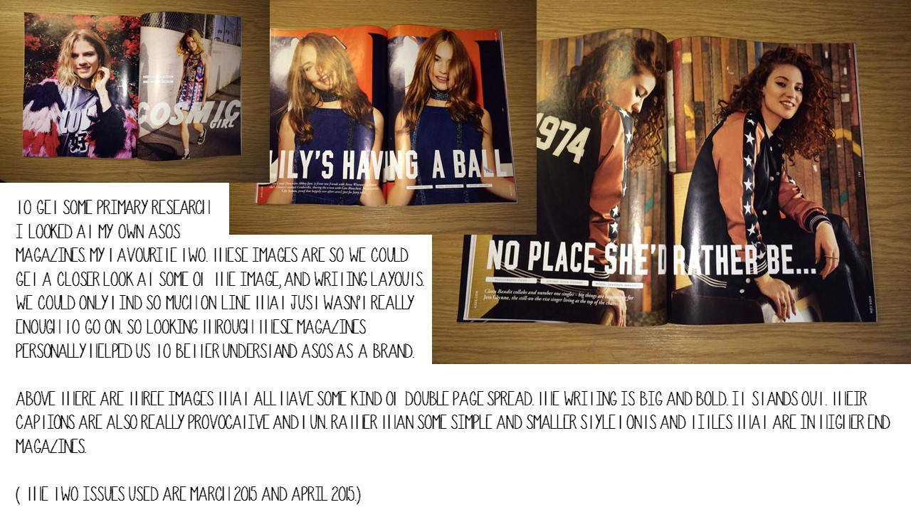


After looking through my own ASOS magazines i managed to find all these little sparks of inspiration. I created it in power point form because i felt it was easier to show the images i was trying to describe.
-Jessica Flavell
Linus Lohoff | Still life photographer research - JF


I loved researching this artist, his still life images really made me smile. I'm happy to be taking inspiration from him, as i think that his work really suits ASOS magazine. His quirky-ness is really uplifting and eye-catching.
-Jessica Flavell
Other Still life images and inspiration.


I have been looking in to other still life lingerie images sourced from the internet. We needed to see how some were shot for layouts, angles, lighting and props. Although we have our own ideas already Its a good idea to be inspired by other professional works. I loved the simplicity of the top image. The colours and the glitter work really well together. I also love all the props used in the second image. Everything is perfectly placed, my only one doubt about that photo is that you can't see the underwear very well, so it looses its advertising perspective.
The last two images are a beautiful composition. their theme and selling point looks really professional and well thought out. This looks like a higher market still life image more for a higher magazine rather than ASOS who we decided to do our article for.
-Jessica Flavell
Subscribe to:
Posts
(
Atom
)
About Me
Popular Posts


Pinterest Gallery
Search This Blog
Instagram Shots
Tweet Tweet
Like us
Search This Blog
Labels
- # practise
- #adore
- #artist
- #asos
- #autumn
- #autumn #winter #inspiration #hermes #university #project #underwear #stilllife
- #beautiful
- #bra
- #delicate
- #editing
- #flames
- #inspo
- #intimate
- #lace
- #lighting
- #lingerie
- #lipstick
- #love
- #mac
- #magazine
- #magazine layout
- #makeup
- #moodboard
- #moodboard #lingerie #ohsosensual #ohsointimate
- #moodboard #lingerie #ohsosensual #ohsointimate #love #bra #lace #sets
- #nike
- #ohsointimate
- #pastel
- #perfume
- #photography
- #photoshoot
- #photoshop
- #practise
- #pretty
- #research
- #research #magazine #asos
- #shoes
- #shoot
- #still life
- #stilllife
- #video
- #website
- #winter
- asos
- british
- copy
- fashion
- layout
- linuslohoff
- magazine
- primary
- project
- quirky
- research
- stilllife
- tea
- toast
- university